NYC Fotoworks Portfolio Review

In June, I attended NYC Fotoworks.

At the moment, portfolio reviews seem to offer the second best way to get in front of buyers that might hire you. I signed up for NYC Fotoworks mostly for this reason, although I was at the tail end of revamping my book, so actual portfolio reviews were a secondary goal.

Each day of the review is structured into 15 minute blocks, with about 20 reviewers. They're all at tables in a big room, and at the 15 minute mark, a sound plays, and the current reviewee says his goodbyes, and makes way for the next. There's a flurry of activity for a bit, then everything settles back down.

There's a lot of energy - photographers are excited to show off their work, and reviewers are eager to meet new people and look at books. Outside of the review room, photographers trade war stories, or handle business.

My approach, finalized in the 90 seconds before my first meeting, and refined throughout the three day event, was to greet the reviewer, and announce, "I'm Rob Prideaux, I work out of San Francisco, I do heroic objects and cautionary tales. I'm looking to meet people in the industry, show them what I do, get feedback, and find out how I can help.", which is pretty dense, especially delivered bluntly, as I do, but "heroic objects and cautionary tales" interested people, and was a good reason to open the book.

After that, I didn't offer much, just let them look, and offered corollary information if the reviewer seemed to want it. The reviewers are all steeped in professional imagery, and they mostly breeze through the book. A few, however, would meander through the book throughout the entire appointment.

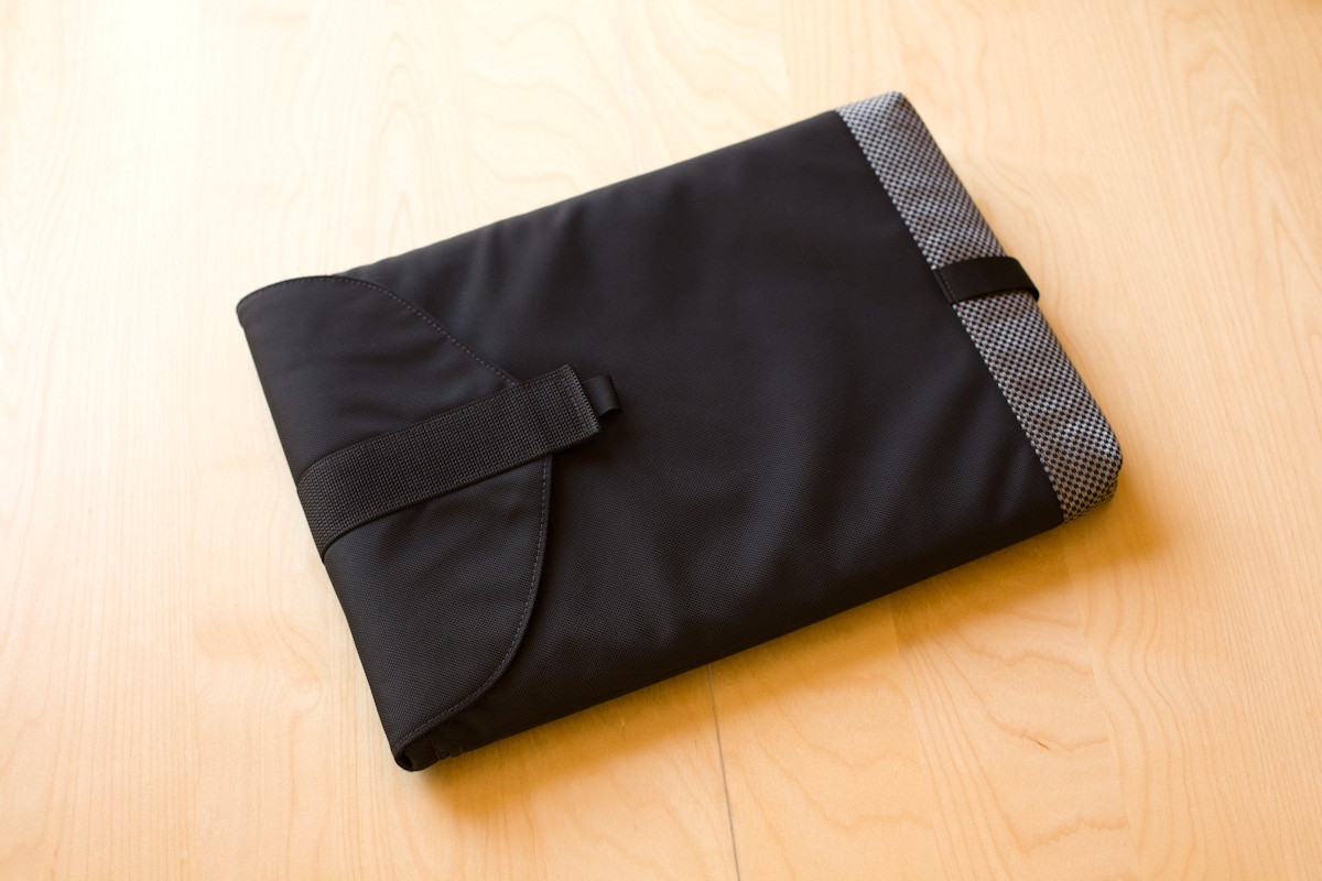
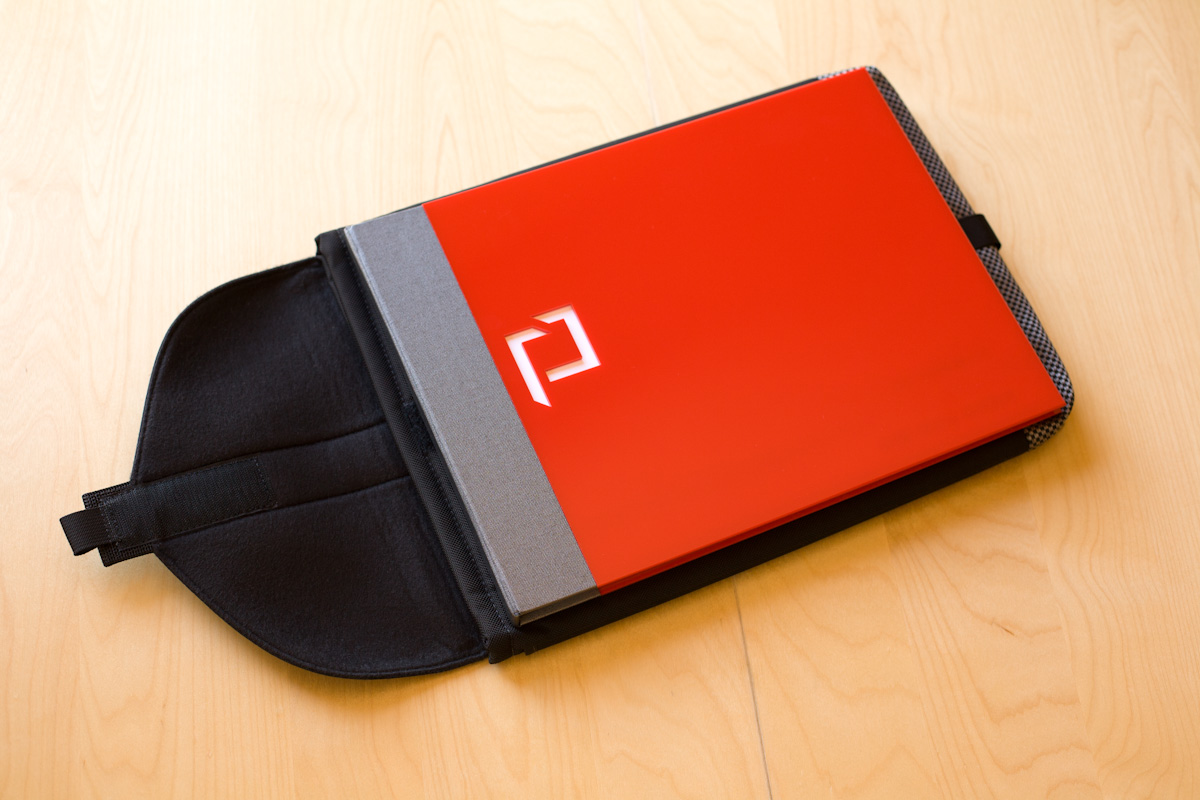
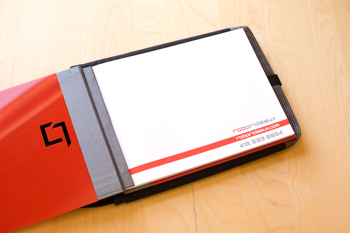
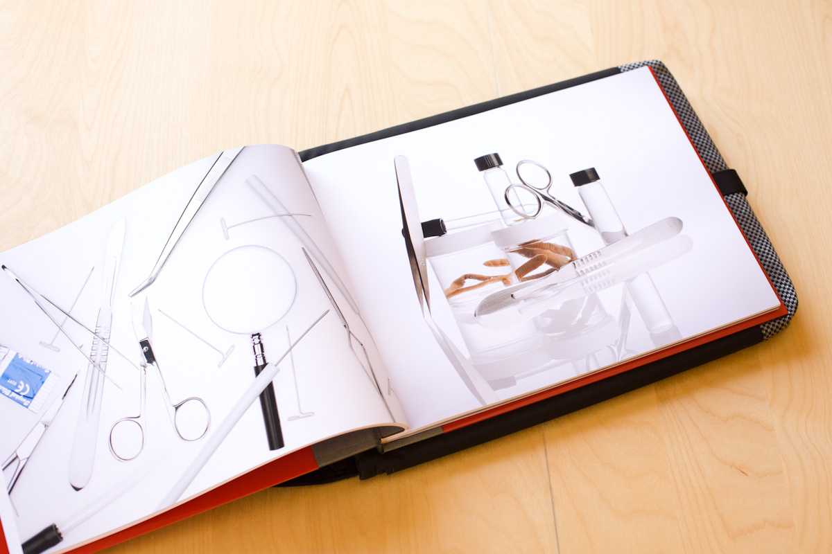
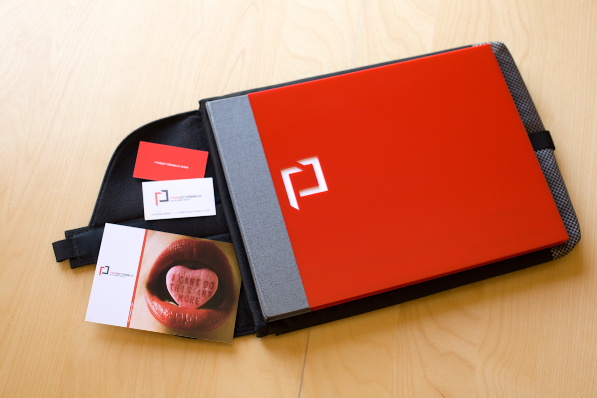
Either way, I tried to steer the conversation. I was showing two books - a new black leather book with about 40 images, and the old red plexiglass book with almost 80 images, and I asked reps to comment on which book they preferred. With photo editors, I asked about how they work with artists based outside of NYC, and how much conceptual stuff they want to do. I asked agency buyers...not much, just tried to get to know them.

About the books, it was impossible to get a consensus. Some people loved the black leather book and thought the red plexiglass book was too much. Others were bored by the black book and loved the red one. Some thought 80 images was too much, others thought 40 wasn't enough. Still, the process worked for me, because I decided to do what I want to do, instead of worrying about what people might want.

Everybody really liked my more conceptual stuff.

People consistently returned to this page, and the basic thread was this: we all have 5000 product photographers within 50 yards of our office, but we're always looking for people who can tell a story, and illustrate an idea. They all want to see the straight-ahead product stuff, so they can get a sense of my technical abilities, but decisions are going to come down to conceptual ability.

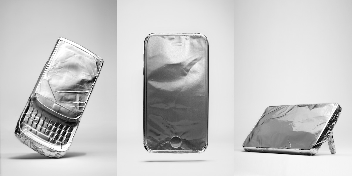
Reviewers liked the 'worlds tiniest portfolio' I made.

The whole thing was a real shot in the arm. Self-promotion can be sort of one-sided, and this was instantly two-way. I heard a lot of enthusiasm for my work, and got a lot of laughs, pluse I got to meet a lot of interesting, smart people. I'm planning on attending the next summer review.

Different Books for Different Folks

I know, who cares about portfolios? I just tweet links to my Dropbox pdfs or whatever. Whatever!

I'm still using my red portfolio, but I recently added a black leather book, because there are a few people who react badly to the red one, I thought I'd make something just for them.

After asking around a bit, I went with a black leather 14 by 11 book from Iris Portfolios, with a silvery buckram box. Iris was recommended by the ever-helpful David Zaitz, and they were helpful and professional throughout.

I took both to NYC Fotoworks, where the corners and edges got all dinged up. As I suspected, some reviewers loved the red one, some loved the new black one, and some were indifferent to either, preferring to focus on the photos.

There's not too much to say about it. It's super nice - everything feels luxurious and looks cohesive. It's more elegant than the red one, and it's more...standard.

Which, of course, is fine. There's really no need to use the covers to try to stand out. Most people are after the work, anyway, and if it's something they want, it doesn't matter if it came loose in a FedEx box covered in donut crumbs. Conversely, if they don't want it, it...well.

At the moment, the black book has a really tight edit of 40 images, and the red one has 76.

I saw a few people at NYC Fotoworks showing work on iPads, but I'm pretty sure it was motion. Much like the black leather portfolio has a strong history in the arts in general, so does the printed, bound portfolio have a strong history in face-to-face meetings. Both my books are rich, detailed, and tactile, each has a scent, and a unique feel. An iPad is useful, but not as good.

Further Along with Mobile Devices

Working on a new portfolio, and today's the first time I've put all the pictures together and had a close look at them. The things I notice:

  • I'm not sure I want to stay with mobile devices. I think I'll expand to the whole high tech category
  • I need to shoot more. I noticed I keep trying to make more pictures via retouching, which has never really worked for me.
  • Turns out completely revolutionizing the way mobile devices are shot is harder than you'd think.

Most of these are most of the way there, but none of them are all the way there. "There" being "finished".

Anyways. What do you think?

Galaxy Tab paper model.

IMG_0215a.jpg

This looks a lot better with a screen, but it still sits there funny. And I don't mean ha ha.

IMG_0575a.jpg

I think this looks better with an image on the screen, but I don't think that's the right image.

I think I can light these in a way that's more exciting. Kinda fun though.

I like this one quite a lot...

but this is my favorite.

On Editing

"Finally on editing, when looking at portfolios you can easily tell within a couple images if this is someone you want to work with. After that it’s all about finding reasons why you don’t want to work with them. Editing out the crap is essential because everyone takes bad pictures. Not letting anyone see them is your job and mine." Words to live by.

via A Photo Editor

Portfolio Revamp

I finished this awhile back. Well, "finished" anyway. Heretofore, it's been difficult to find enough pictures to put in my book. This time around, I'm doing double-sided pages and I'm still pushing the physical limit of the book, so here's to making pictures.

Naturally, it's a real question as to whether a printed portfolio is necessary any longer. If I ask, "Would I rather have a portfolio if someone asks for one?", the answer is obvious.

I'm still using the Waterfield cases I got, and I still haven't found a good way to identify myself on the outside of the case. Embroidery might be nice, or some kind of slick luggage tag. Or maybe I'll just stick a business card on it with a mess of gaffers tape. Ha.

I still like my custom cut and beveled red plexiglass covers with grey chrome fabric binding. I've got a variety of responses, from "Looks like you're trying too hard." to "This totally introduces your style perfectly." So.

I'm printing on Moab Lasal doublesided. I tried a bunch of different papers, and I like the detail, saturation, and tactile sensation of the Lasal best. Toothier papers softened up my images too much, although they feel more luxurious and arty.

Of course, the matte papers scratch so easily, especially in big black fields, which you find a lot in my portfolio. I wonder about the various sprays - they don't seem to do anything, but I keep trying. This time I tried the Krylon one, and it seems to be as ineffective as the rest. It did, however, make my book smell like a man's clean cologne. I kind of like it, but I'm airing it out, since people get freaky about odors and chemicals.

So yeah, most of the time, people use the website, sure. But I'm ready for the rest of the time as well. Plus I have to say, websites are nice, but looking at this book is a pleasure of a different order.