Did you know that people used to wear timepieces on the wrist?

I've never worn, with any kind of commitment, a wristwatch.
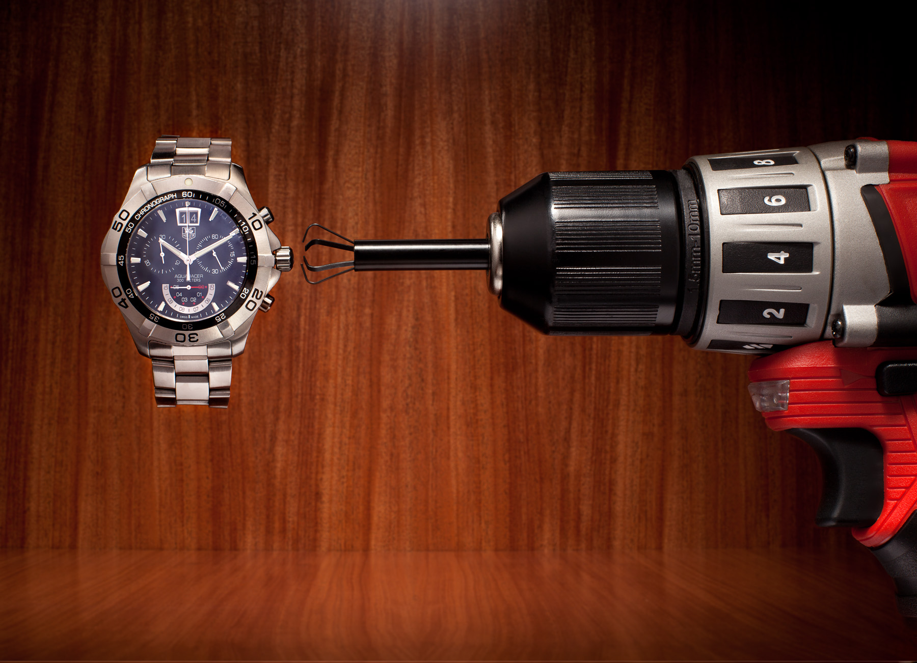
I imagine that having to wind a watch would eventually become a chore.
Did you know that people used to have to wind their watches?
Did you know that people used to wear timepieces on the wrist?
I've never worn, with any kind of commitment, a wristwatch.
I imagine that having to wind a watch would eventually become a chore.
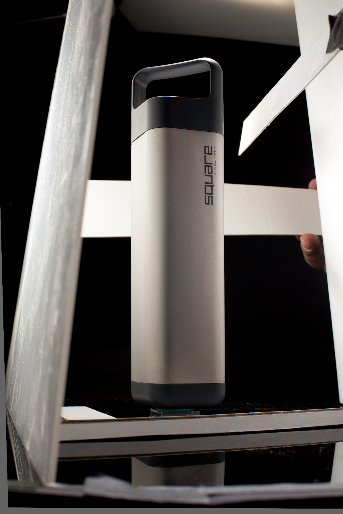
David from Clean Bottle contacted me recently. He's launching a new product, and wanted new photography to kick it off.
We decided to do one heroic shot as a leader, and...
...a sort of survey in a more catalog style.
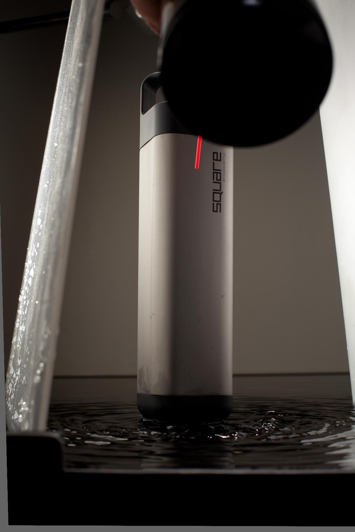
I wanted to do the water shot, and I wanted to give Dave a straight black shot, and I didn't want to light it twice, so I elevated it over black plex, and my assistant, Josh, built a short lip around it, to contain the water later.
To make ripples, we tried jiggling the plex, hitting the underside with a mallet, and streaming water in from a hose. After all, we found that shooting air down the front surface worked the best.
Channelling Irving Penn.
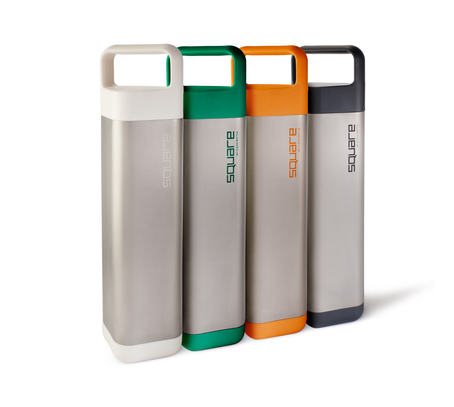
The bottle comes in four colors, but at shoot time, Dave only had a black bottle, a white bottle, and two Pantone codes.
I created the green and orange bottles from the white bottle, and put the four together in post, although the group shot above was done on set. I am slightly allergic to Photoshop, and much prefer to get it in camera, but at time like this, it just makes more sense to do it in post. Getting the colors right, since "color" is such a complex phenomenon, took a lot of finessing with the hue, and the value, not to mention different qualities and colors of light in the various shots.
A fast, very technical shoot to kick off a very interesting new product!
More info: There's a Square Bottle Kickstarter on through Oct 11, and they're already 75% of the way there.

Featured on Gear Patrol today, the new Square Bottle.


I know, who cares about portfolios? I just tweet links to my Dropbox pdfs or whatever. Whatever!

I'm still using my red portfolio, but I recently added a black leather book, because there are a few people who react badly to the red one, I thought I'd make something just for them.
After asking around a bit, I went with a black leather 14 by 11 book from Iris Portfolios, with a silvery buckram box. Iris was recommended by the ever-helpful David Zaitz, and they were helpful and professional throughout.

I took both to NYC Fotoworks, where the corners and edges got all dinged up. As I suspected, some reviewers loved the red one, some loved the new black one, and some were indifferent to either, preferring to focus on the photos.
There's not too much to say about it. It's super nice - everything feels luxurious and looks cohesive. It's more elegant than the red one, and it's more...standard.
Which, of course, is fine. There's really no need to use the covers to try to stand out. Most people are after the work, anyway, and if it's something they want, it doesn't matter if it came loose in a FedEx box covered in donut crumbs. Conversely, if they don't want it, it...well.
At the moment, the black book has a really tight edit of 40 images, and the red one has 76.
I saw a few people at NYC Fotoworks showing work on iPads, but I'm pretty sure it was motion. Much like the black leather portfolio has a strong history in the arts in general, so does the printed, bound portfolio have a strong history in face-to-face meetings. Both my books are rich, detailed, and tactile, each has a scent, and a unique feel. An iPad is useful, but not as good.
7x7 asked me to photograph this Hermes scarf, flat, for an upcoming Radar feature. I photographed it flat. And then I photographed it some more.
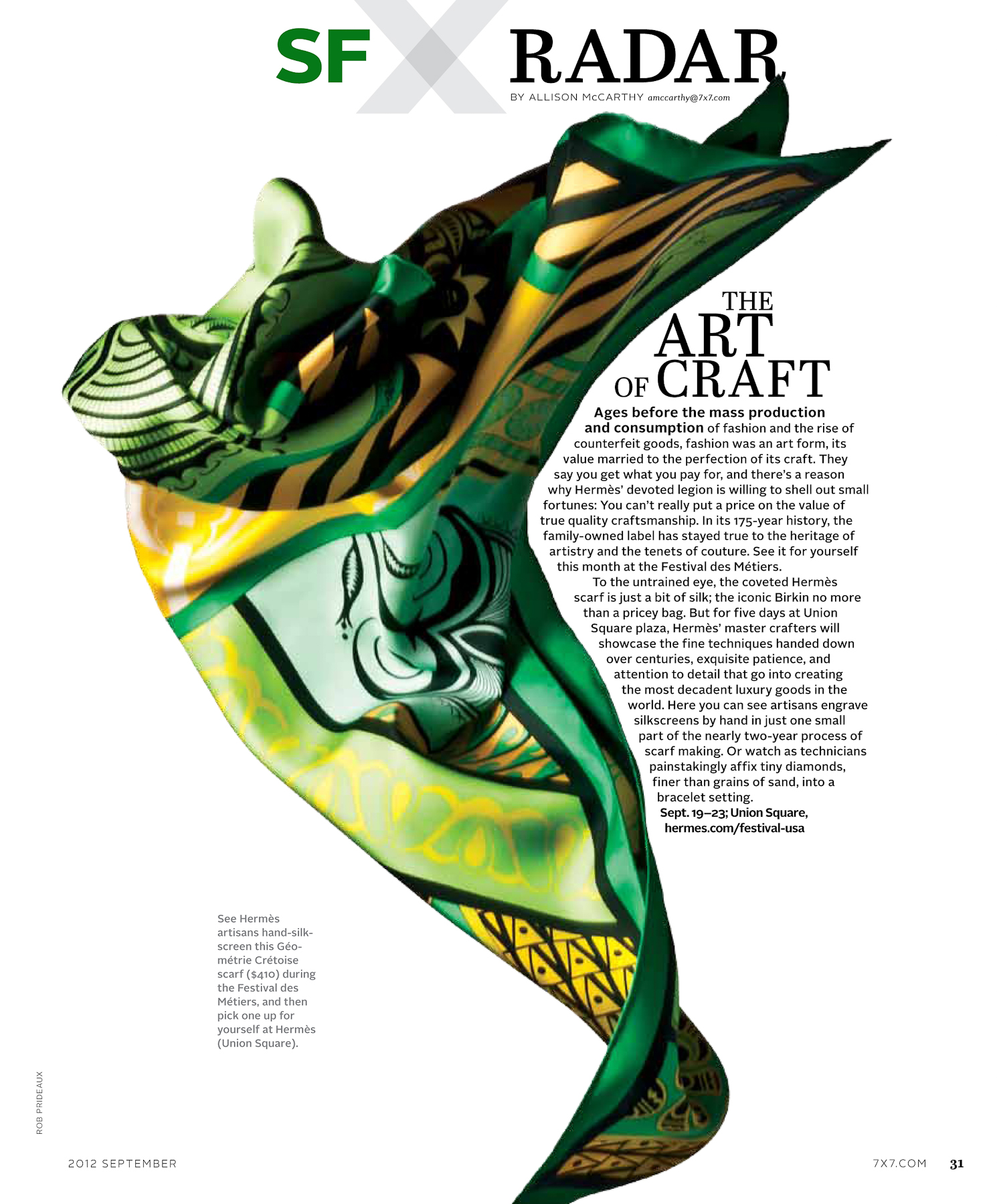
I'm quite glad they selected one of the floating scarves over the flat one. It was nice to see the entirety of the scarf design, but the floating one ends up being much more interesting.
In 7x7 Magazine now.