I love my 1400

Well, I was loving it a lot more before it started putting a black smudge on the trailing corner of the paper. But that's the middle of the story.

My first photo printer was an Epson 2200, the workhorse in it's class at the time. I was pretty amazed when the first print came out of it, but I slowly grew to hate it. Doing work prints wasn't too bad, but printing a portfolio was an expensive, frustrating process, with many wasted pages and ink, not to mention time. Eventually, the thing had a one in five chance of doing an acceptable print, and I gave it away on Craigslist, and the 10 ink cartridges I included were payment for hauling the little monster away.

I had always hated the look of pigment inks on matte paper, so I had done that portfolio on luster. The luster paper was on a roll, and it never truly flattened out, plus the surface was forever slightly tacky, so handling the portfolio was off. After doing some research, I came to understand the basic difference between pigment-based inks and dye-based inks:

  • Pigment inks last a real long time
  • Dye inks have better saturation

Since I do work prints (pinned up on the wall for a month or so, then stored) and portfolio prints (stored in a book for a year or two, on display for 30 minutes at a time), I realized I don't really care if they last very long. Well, I don't need them to last a hundred years, anyway, and I'm way more interested in saturation. Further, the dye inks, especially the blacks, are far richer on matte paper than the pigment inks.

So I marched down to Staples and got an Epson 1400, which was on sale for less than $300.

It's been real good to me so far. It prints pretty fast, for my purposes at least, the prints look great using the Epson settings (which is good because the drivers are pretty lame), it never jams, and there are a bunch of improvements:

  • Full bleed printing (although...)
  • When an ink cartridge runs out, the current print pauses, and resumes when a new cartridge is installed. The 2200 would spit out the current print, wasting it.
  • It's a little bit smaller
  • The Claria inks produce rich, even blacks, which are far better than the 2200 ever did

It's not all peachy though. Recently, the 1400 started smudging the prints as they exit the printer. I took a look inside, and there a couple of foamy reservoirs, and a fabric pad, and all that stuff was pretty soaked with ink. I was doing a lot of full bleed printing, with a lot of black, and it turns out that when it does full bleed, the overspray goes on that fabric pad. I think I overwhelmed it. I took it to Deen's in Richmond and they fixed it up for $85.

Also, on the portfolio front, I've cut, punched and scored a book by hand, and can't ever get the pages to square up exactly right. So I've been taking the sets of prints to JR Press, but they recently suggested I just bring them stacks of blank pages, and I was all, duh.

Overall, I'm pretty amazed at what I'm able to produce in the office, from big art prints to small runs of deluxe promos, work prints to portfolios. Just add a paper cutter, a bone folder, an X-Acto, and some glue, and I'm set.

No Such Thing as a Failed Experiment

I tested out a method to wrangle fire recently, in my long-term mission to devise a way to encourage explosions to form more recognizable shapes. As an aside, people get all uncomfortable once you mention gasoline explosions. Usually, the volume of fuel I'm using is in the milliliters range, and the total volume of fuel on site is less than one gallon, but I guess without more explanation, people imagine the kind of stuff you see in action movies. Which would be AWESOME, don't get me wrong.

Anyways, the idea here was to see what I could get into acrylic tubes.

_MG_4263.jpg

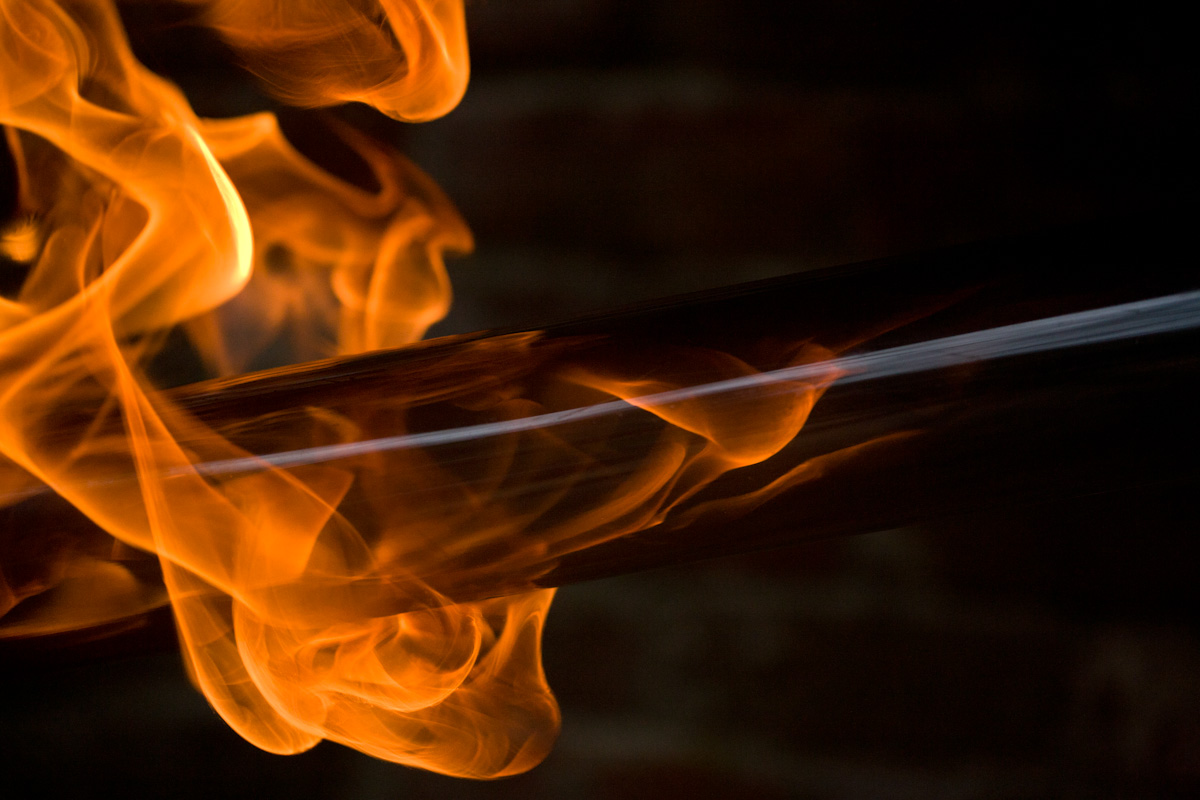
And initially...soot. Soot is what I get. This is the first attempt, and the soot preceded the flame, immediately blackening the inside of the tube.

Even that might work, if I was getting what I see in my head, a tightly packed explosion. But there's no sense of containment or channeling. I think the pressure is too low. And of course, any increase in pressure leads to a pretty dramatic increase in danger.

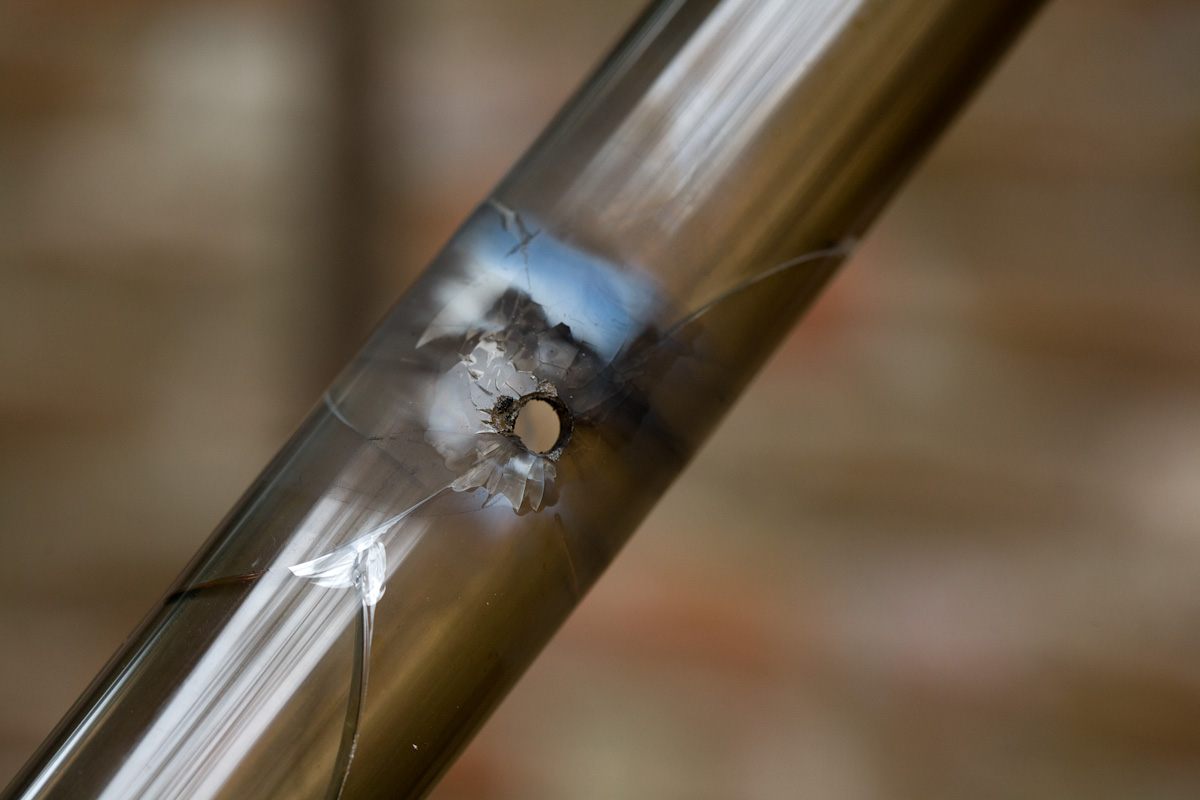
And even with minimal pressure, the acrylic tubes don't stand up too well. I drilled this hole so I could insert a match near the middle of the tube, but you can see how the heat discolors and cracks the tube.

Never mind this much thinner acrylic, which withstood only two applications of burning gasoline.

So, back to the drawing board.

Content Interpretation is Subjective.

I started working with a new client, a new jewelry designer named Victoria Skirpa. We made these images for her self-promotional materials. She's really putting a lot of energy into the endeavor and it's nice to work with someone so fired-up.

Sometimes on set, an image shifts into an unintended look. I've seen it happen dozens of times: the setup is supposed to be one thing, but looked at with a certain attitude, it looks like a completely different thing. Once that starts happening, it's really hard to avoid, and I've learned to keep my mouth shut when I see a shift like that, because much of the time, it's a peculiarity of the moment, but it can totally derail the shoot.

But for a time during this shoot, this looked unavoidably like three little brown googly-eyed creatures.

The New Website

So the new website is launched. I looked around at all the prepackaged photographer-type sites, and while I was impressed with many of them, I just couldn't get them to do what I want. The main thing with most of them was a maximum image size that is too small.

The new site features the enhanced version of Simpleviewer, which means I can configure pretty much everything on it. It will scale with the window size, and do a full-screen mode with images up to 1500 pixels. It preloads images, and works with the on-screen buttons, the mousewheel, or the keyboard.

I added a bio and contact section, revamped the organization of the images, implemented a rotating bio pic feature, and made the gradient background scale with the window size. I know, big whoop.

The blog has slowly evolved from an ugly Blogger site, to a really clean Wordpress design that's fully integrated into the rest of the site. For any factor other than initial setup, Wordpress is a far superior product to Blogger.

For those who are interested, here are some of the better- and less-known solutions I looked into:

  • Carbonmade. I liked this well enough, it's very cute and clever, and the back-end's nice, but the template is pretty rigid, and I couldn't come up with a look I cared for.
  • Indexhibit. This is quite powerful and versatile, although not super easy to use. It all ends up looking very CSS3-hipster-huge-font-2009 web, which I like well enough, but it clashes with my photo style.
  • Cargo Collective. Same story as Indexhibit, plus some social networking features.
  • INDXR. This one is pretty powerful, but in the end, again, too hipster for me.
  • Bludomain. Just to show you how I was all over the map. But seriously, although most of their templates seem to be for wedding photographers, I liked the Harvey design a lot. It's too Harvey though.
  • A Photo Folio. Has some real nice designs, but beyond this year's budget.
  • Livebooks. The 800 pound gorilla turned me off because...because it's the 800 pound gorilla. I mean I love gorillas, but I don't want one introducing me to people.
  • TAXI. I was using this for awhile, but it'll never be my primary website. It's really global in it's focus, so I'll get back to this one when I'm in a better position to begin my global domination plan.
  • Dripbook. I looked into Dripbook because you can generate a stand-alone website from your Dripbook account. That didn't work out for me, but the site's really great, and I've ended up using it on it's own, plus I'm using it as the mobile version of robprideaux.com.

Thanks to all those who helped out with technical advice (looking at you, Scott), and everybody who tested (thanks Facebook buddies and Steve).