Mucking About with Precious Objects

I suppose it's a reliable question: put expensive things with cheap things, or put expensive things with expensive things? Contrast or complement? Tension or calm? It's not like you have to commit to one path or another for a lifetime, but within one photograph, you do. 30" Pearl 

Strand with Diamond Clasp at Kathleen Dughi

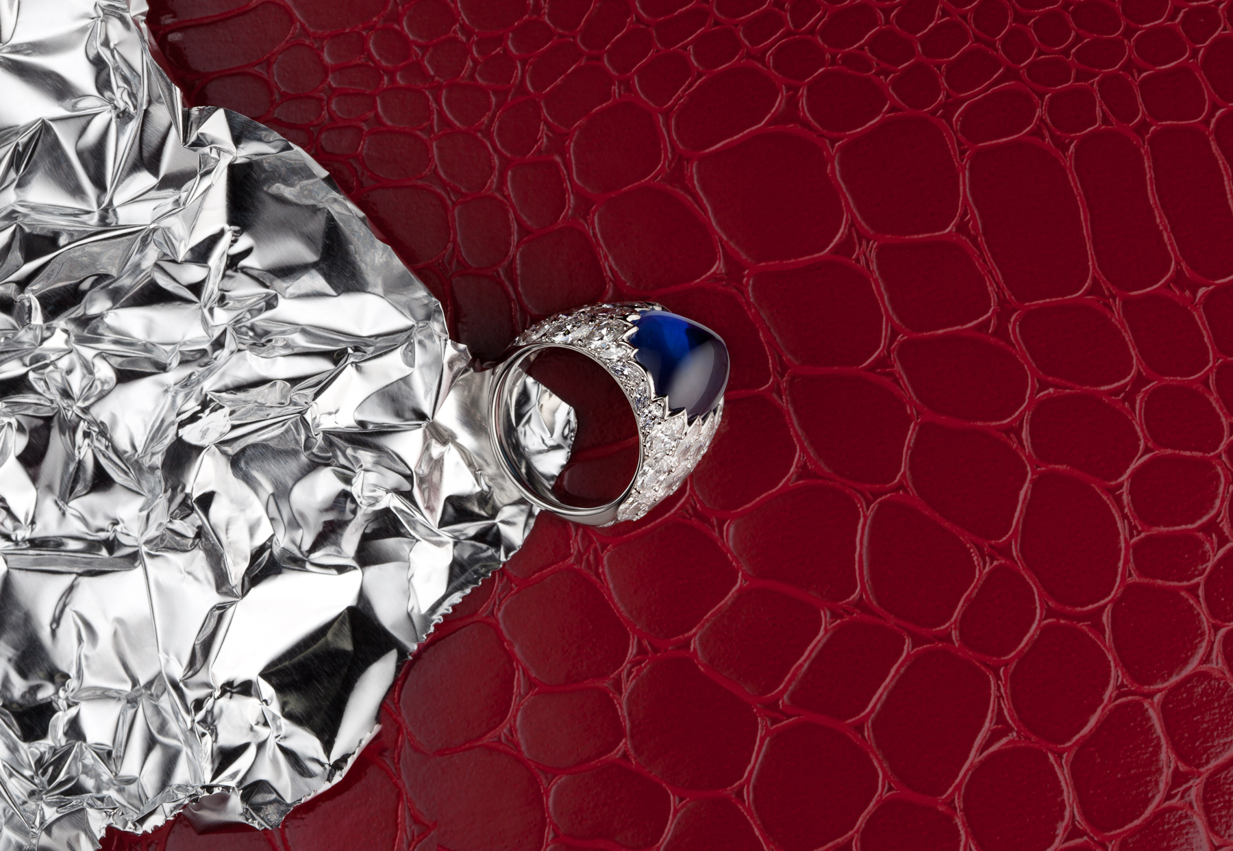
Sapphire Cabochon White Gold Ring with Marquise Diamonds at Kathleen Dughi

South Sea Pearl Earrings with Diamond Settings at Kathleen Dughi

New Work for Kathleen Dughi

This is a really interesting ring, because large, untreated sapphires are usually faceted. Kathleen Dughi bucks the trends though, and manages to demonstrate good taste at the same time. Under the lights, cabochons tend to throw the liquid look more consistently than faceted gems.

Sapphire Cabochon White Gold Ring with Marquise Diamonds

Selected for Something Personal

That's right. Instagram pictures of the little one. This one got selected for the APA SF Something Personal Exhibition.

I spent much of this year making images that are really commercial, as I discovered when I looked through my set of images for 2011. There's a lot of product stuff - jewelry, shoes, phones and tablets - but none of it seemed "personal" enough. Much more than in previous years, a lot of the pictures were for clients, and those aren't allowed.

If I ever thought it was hard to be objective about my own photographs, it's even harder to do so about photographs of my son. I struggled with submitting these because, well, Instagram pictures of my kid!

But they're definitely mine.

Paper or Plastic

An ad I shot for EuroRSCG and Credit Suisse launched recently. It's part of a campaign to show how Credit Suisse helps their clients thrive, and it's a pretty big campaign, running in financial press, airports, and all over the web (press release here). So, that's a four foot by three foot sculpture made of paper, by LA artist Jeff Nishinaka. The easy part was that Jeff's sculpture does a lot of the work. The hard part was that my tools were really limited. I needed to accentuate Jeff's narrative without overwhelming it, and draw the user into an intriguing story, then let them realize they're looking at a sculpture. And I needed to do that without composition, color, or focus. All I had to work with was tone - black and white and everything in between - but just that.

Jeff was kind enough to cut me some samples, and, about a month before the shoot, I spent an afternoon experimenting with different looks. I worked with a great art director, who wanted to see some variations. You see on there, looking more plastic than the other.

I had a fantastic crew down in LA, Jeff was a great host, and the whole thing was a lot of fun.

On the Credit Suisse site.